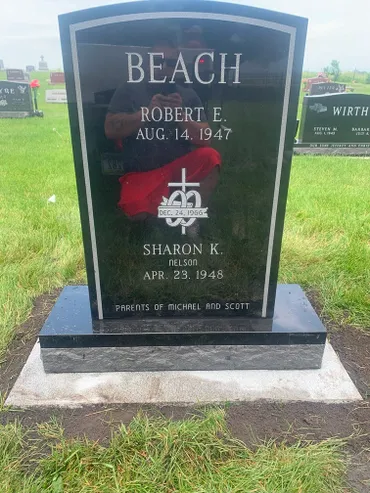
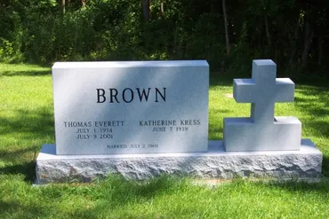
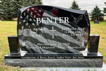
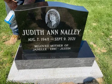
/* ===============================
   Legacy Stone Memorials — Premium Dark Theme
   Black / Charcoal / Gold
   Serif headings + Sans body
   =============================== */

:root{
  --bg:#060607;
  --bg2:#0c0d10;
  --surface:#101218;
  --surface2:#141827;

  --text:#f3f1eb;
  --muted:#b8b3a7;
  --muted2:#8e8a80;

  --gold:#d8b15a;
  --gold2:#b8923d;
  --goldGlow: rgba(216,177,90,.20);

  --border: rgba(255,255,255,.10);
  --border2: rgba(255,255,255,.14);
  --borderGold: rgba(216,177,90,.26);

  --serif: "Cinzel", ui-serif, Georgia, "Times New Roman", serif;
  --sans: "Manrope", ui-sans-serif, system-ui, -apple-system, Segoe UI, Roboto, Arial, sans-serif;

  --max: 1180px;
  --r-lg: 18px;
  --r-md: 14px;
}

*{ box-sizing:border-box; }
html,body{ height:100%; }
body{
  margin:0;
  background:
    radial-gradient(1200px 600px at 20% -10%, rgba(216,177,90,.10), transparent 60%),
    radial-gradient(900px 500px at 80% 0%, rgba(216,177,90,.07), transparent 55%),
    var(--bg);
  color:var(--text);
  font-family:var(--sans);
  line-height:1.6;
}

/* Prevent random horizontal scroll on mobile */
html, body{ overflow-x:hidden; }

img{ max-width:100%; height:auto; display:block; }
a{ color:var(--text); text-decoration:none; }
a:hover{ color:var(--gold); }

.container{
  width:min(var(--max), calc(100% - 40px));
  margin:0 auto;
}

.section{
  padding: clamp(48px, 6vw, 84px) 0;
}
.section--alt{
  background: linear-gradient(180deg, rgba(255,255,255,.03), transparent 60%);
}

h1,h2,h3{
  font-family: var(--serif);
  letter-spacing:.06em;
  text-transform:uppercase;
  margin:0 0 12px;
}
h1{ font-size: clamp(34px, 4vw, 56px); line-height:1.05; }
h2{ font-size: clamp(26px, 2.6vw, 40px); line-height:1.15; }
h3{ font-size: clamp(18px, 2vw, 24px); }

p{ margin:0 0 14px; opacity:.94; }
.muted{ color:var(--muted); opacity:1; }
.small{ font-size:.95rem; color:var(--muted); opacity:1; }

.gold-rule{
  height:1px;
  background: linear-gradient(90deg, transparent, var(--gold), transparent);
  box-shadow: 0 0 18px var(--goldGlow);
  margin: 18px 0 26px;
}

.card{
  background: linear-gradient(180deg, rgba(255,255,255,.03), rgba(255,255,255,.01));
  border:1px solid var(--border);
  border-radius: var(--r-lg);
  padding: 22px;
}
.card--gold{
  border-color: var(--borderGold);
  box-shadow: 0 0 0 1px rgba(216,177,90,.08) inset;
}

.grid{ display:grid; gap:18px; }
.grid-2{ grid-template-columns: repeat(2, minmax(0,1fr)); }
.grid-3{ grid-template-columns: repeat(3, minmax(0,1fr)); }
@media (max-width: 900px){
  .grid-2,.grid-3{ grid-template-columns: 1fr; }
}

/* ===============================
   Buttons
   =============================== */
.btn{
  display:inline-flex;
  align-items:center;
  justify-content:center;
  gap:10px;
  padding: 12px 18px;
  border-radius: 999px;
  font-weight: 750;
  letter-spacing: .02em;
  transition: transform .15s ease, box-shadow .15s ease, background .15s ease, border-color .15s ease;
  will-change: transform;
  cursor:pointer;
}
.btn:active{ transform: translateY(1px); }

.btn--gold{
  background: linear-gradient(180deg, var(--gold), var(--gold2));
  color:#0b0b0d;
  border:1px solid rgba(0,0,0,.25);
  box-shadow: 0 10px 28px rgba(0,0,0,.35), 0 0 0 1px rgba(216,177,90,.14) inset;
}
.btn--gold:hover{
  transform: translateY(-1px);
  box-shadow: 0 12px 34px rgba(0,0,0,.45), 0 0 0 1px rgba(216,177,90,.20) inset;
}

.btn--outline{
  background: transparent;
  color: var(--text);
  border: 1px solid var(--borderGold);
}
.btn--outline:hover{
  border-color: rgba(216,177,90,.55);
  box-shadow: 0 0 0 4px rgba(216,177,90,.10);
}

.btn-row{
  display:flex;
  gap:12px;
  flex-wrap:wrap;
}

/* ===============================
   Hero
   =============================== */
.hero{
  padding: 72px 0;
  background:
    radial-gradient(900px 420px at 20% 0%, rgba(216,177,90,.12), transparent 60%),
    radial-gradient(800px 380px at 85% 10%, rgba(216,177,90,.08), transparent 55%);
}
.kicker{
  letter-spacing:.12em;
  text-transform:uppercase;
  font-weight:800;
  color: var(--muted);
  margin-bottom: 12px;
}
.hero p{
  max-width: 820px;
  color: var(--muted);
  opacity: 1;
}

/* ===============================
   Lists / checklist
   =============================== */
.checklist{
  list-style:none;
  padding:0;
  margin: 12px 0 0;
}
.checklist li{
  padding-left: 26px;
  margin: 10px 0;
  position: relative;
  color: var(--text);
  opacity: .93;
}
.checklist li::before{
  content:"✓";
  position:absolute;
  left:0;
  top:0;
  color: var(--gold);
  font-weight: 900;
}

/* ===============================
   Forms
   =============================== */
label{ display:block; margin: 10px 0 6px; color: var(--muted); font-weight: 650; }
input, textarea, select{
  width:100%;
  background: rgba(255,255,255,.03);
  border: 1px solid var(--border);
  color: var(--text);
  border-radius: 12px;
  padding: 12px 12px;
}
input:focus, textarea:focus, select:focus{
  outline:none;
  border-color: rgba(216,177,90,.55);
  box-shadow: 0 0 0 4px rgba(216,177,90,.10);
}
textarea{ min-height: 140px; resize: vertical; }

.form-row{
  display:grid;
  grid-template-columns: 1fr 1fr;
  gap: 14px;
}
@media (max-width: 800px){
  .form-row{ grid-template-columns: 1fr; }
}

/* ===============================
   Footer
   =============================== */
.site-footer{
  border-top: 1px solid var(--border);
  background: rgba(0,0,0,.20);
}
.footer-inner{
  padding: 34px 0;
  display:grid;
  grid-template-columns: 1.2fr 1fr 1fr;
  gap: 18px;
}
.footer-inner a{ color: var(--muted); }
.footer-inner a:hover{ color: var(--gold); }

@media (max-width: 900px){
  .footer-inner{ grid-template-columns: 1fr; }
}

.footer-bottom{
  border-top:1px solid rgba(255,255,255,.06);
  padding: 14px 0;
  color: var(--muted2);
  font-size: .95rem;
}

/* Footer CTA buttons */
.footer-cta{
  display:flex;
  gap:10px;
  flex-wrap:wrap;
  justify-content:center;
  margin: 18px 0 10px;
}

/* Mobile Sticky Bottom Bar */
.mobile-bottom-bar{ display:none; }
@media (max-width: 980px){
  .mobile-bottom-bar{
    display:flex;
    position:fixed;
    left:0; right:0; bottom:0;
    gap:10px;
    padding: 12px 12px calc(12px + env(safe-area-inset-bottom));
    background: rgba(6,6,7,.92);
    backdrop-filter: blur(10px);
    border-top: 1px solid rgba(255,255,255,0.10);
    z-index: 9999;
  }

  .mbb-btn{
    flex:1;
    text-align:center;
    padding:14px 12px;
    border-radius: 999px;
    font-weight: 800;
    text-decoration:none;
    white-space:nowrap;
  }

  .mbb-book{
    background: linear-gradient(180deg, var(--gold), var(--gold2));
    color:#0b0b0d;
    border:1px solid rgba(0,0,0,.25);
  }

  .mbb-call{
    border: 1px solid var(--borderGold);
    color: var(--text);
  }

  /* prevent content from hiding behind sticky bar */
  body{ padding-bottom: 78px; }
}

/* ===============================
   Utility
   =============================== */
.hr{ height:1px; background: rgba(255,255,255,.08); margin: 16px 0; }
.breadcrumbs{ font-size:.95rem; color: var(--muted); margin-bottom: 16px; }
.breadcrumbs a{ color: var(--muted); }
.breadcrumbs a:hover{ color: var(--gold); }
code{ color: var(--gold); }

/* ==========================================================
   HEADER — FINAL (single source of truth)
   Desktop: centered logo above nav (no CTA)
   Mobile: logo + Menu button + slide-down links
   ========================================================== */

.site-header{
  position: sticky;
  top:0;
  z-index:999;
  background: rgba(6,6,7,.92);
  backdrop-filter: blur(10px);
  border-bottom: 1px solid var(--border);
}

/* Full-width header band (so logo spans the middle of the window) */
.site-header .container{
  width: 100%;
  max-width: none;
  margin: 0 auto;
  padding-left: 20px;
  padding-right: 20px;
}

/* Desktop vs Mobile blocks */
.header-desktop{ display:block; }
.header-mobile{ display:none; }

/* Desktop logo row */
.header-logo--center{
  width: 100%;
  display:flex;
  justify-content:center;
  padding: 6px 0 2px;   /* tighter */
}

/* IMPORTANT: control “spanning width” here */
.header-logo--center .header-logo-img{
  width: min(680px, 88vw);   /* slightly smaller */
}

/* Desktop nav row */
.nav--center{
  display:flex;
  align-items:center;
  justify-content:center;
  gap: 16px;
  flex-wrap: wrap;
  max-width: 1180px;
  margin: 0 auto;
  padding: 0 0 14px;
}

/* Nav link styling */
.nav--center a{
  padding: 10px 10px;
  border-radius: 10px;
  font-weight: 650;
  opacity:.92;
  white-space: nowrap;
  color: var(--text);
}

.nav--center a:hover{
  color: var(--gold);
  background: rgba(216,177,90,.08);
}

.nav--center a.active{
  color: var(--gold);
  box-shadow: 0 0 0 1px rgba(216,177,90,.25) inset;
}

/* Mobile header layout */
.header-inner{
  display:flex;
  align-items:center;
  justify-content:space-between;
  padding: 14px 0;
  gap: 12px;
}

.nav-toggle{
  display:none;
  background: transparent;
  border: 1px solid var(--border2);
  color: var(--text);
  border-radius: 12px;
  padding: 10px 12px;
}

/* Mobile breakpoint */
@media (max-width: 980px){
  .header-desktop{ display:none; }
  .header-mobile{ display:block; }

  /* Mobile logo size */
  .header-mobile .header-logo-img{
    width: 220px;
    height: auto;
  }

  .nav-toggle{
    display:inline-flex;
    align-items:center;
    gap:8px;
  }

  .mobile-nav{
    display:none;
    border-top:1px solid var(--border);
    background: rgba(6,6,7,.92);
    margin-top: 10px;
    border-radius: 14px;
    overflow:hidden;
  }
  .mobile-nav.open{ display:block; }

  .mobile-nav a{
    display:block;
    padding: 14px 14px;
    border-bottom:1px solid rgba(255,255,255,.06);
    color: var(--text);
    font-weight:650;
  }
  .mobile-nav a:hover{ color:var(--gold); }
}
/* ==========================================================
   HEADER HEIGHT — FINAL COMPACT (paste at very bottom)
   ========================================================== */

/* tighten the whole header band */
.site-header .container{
  padding-left: 20px;
  padding-right: 20px;
}

/* LOGO ROW: remove extra vertical space */
.header-logo--center{
  padding: 6px 0 0 !important;      /* was larger */
  margin: 0 !important;
  line-height: 0 !important;        /* kills invisible “text line” space */
}

/* LOGO IMAGE: keep wide, less tall */
.header-logo--center .header-logo-img{
  width: min(680px, 88vw) !important;
  height: auto !important;
  display: block !important;
}

/* NAV ROW: pull it closer to the logo */
.nav--center{
  padding: 4px 0 10px !important;   /* was 14px bottom */
  margin-top: 0 !important;
}

/* optional: tighten nav item padding slightly (keeps luxury feel) */
.nav--center a{
  padding: 9px 10px !important;
}
/* HEADER — Slightly shorter desktop logo */
.header-logo--center .header-logo-img{
  width: min(620px, 86vw) !important; /* was ~680+ */
  height: auto !important;
}
.header-logo--center{
  padding: 4px 0 0 !important;
}
.nav--center{
  padding: 4px 0 10px !important;
}
/* =========================================
   HEADER — FINAL PROPORTION TUNE
   ========================================= */

/* Remove extra vertical spacing completely */
.header-logo--center{
  padding: 0 !important;
  margin: 0 !important;
  line-height: 0 !important;
}

/* Control visual height here */
.header-logo--center .header-logo-img{
  width: min(600px, 82vw) !important;   /* smaller, more refined */
  height: auto !important;
  display: block !important;
}

/* Pull nav closer */
.nav--center{
  padding: 6px 0 12px !important;
  margin-top: 0 !important;
}
.header-logo--center .header-logo-img{
  width: min(560px, 80vw);
  height: 90px;          /* force visual height */
  object-fit: contain;
}
.header-logo--center .header-logo-img{
  width: min(520px, 75vw);
}
.header-logo--center{
  padding: 18px 0 8px;
}
@media (max-width: 768px){
  .header-logo--center{
    padding: 14px 0 6px;
  }
}
.hero-buttons{
  gap: 12px;
}
/* =========================================
   PRODUCTS PAGE (products.html)
   ========================================= */

.page-hero{
  padding: clamp(42px, 5vw, 70px) 0;
  background:
    radial-gradient(900px 420px at 20% 0%, rgba(216,177,90,.12), transparent 60%),
    radial-gradient(800px 380px at 85% 10%, rgba(216,177,90,.08), transparent 55%);
  border-bottom: 1px solid rgba(255,255,255,.06);
}

.page-hero__inner{
  display:grid;
  grid-template-columns: 1.15fr .85fr;
  gap: 28px;
  align-items:center;
}

.page-hero__copy h1{
  margin-bottom: 10px;
}

.page-hero__copy p{
  color: var(--muted);
  opacity: 1;
  max-width: 60ch;
}

.page-hero__media img{
  width:100%;
  border-radius: var(--r-lg);
  border: 1px solid rgba(216,177,90,.18);
  background: rgba(0,0,0,.18);
}

.hero-cta-row{
  display:flex;
  gap: 12px;
  flex-wrap:wrap;
  margin-top: 16px;
}

.hero-bullets{
  margin: 16px 0 0;
  padding-left: 18px;
  color: var(--muted);
}

.hero-bullets li{
  margin: 8px 0;
}

/* Section helpers */
.section--tight{
  padding: clamp(34px, 4vw, 56px) 0;
}

.section--cta{
  padding: clamp(44px, 5vw, 70px) 0;
}

/* Filter bar */
.filter-bar{
  display:flex;
  align-items:center;
  justify-content:space-between;
  gap: 14px;
  flex-wrap:wrap;
  padding: 14px 16px;
  border-radius: var(--r-lg);
  border: 1px solid rgba(255,255,255,.08);
  background: rgba(255,255,255,.02);
}

.filter-bar__title{
  color: var(--muted);
  font-weight: 800;
  letter-spacing: .04em;
  text-transform: uppercase;
  font-size: .95rem;
}

.filter-bar__buttons{
  display:flex;
  gap: 10px;
  flex-wrap:wrap;
}

.filter-btn{
  background: transparent;
  border: 1px solid rgba(216,177,90,.22);
  color: var(--text);
  border-radius: 999px;
  padding: 10px 14px;
  font-weight: 750;
  cursor:pointer;
  transition: transform .15s ease, box-shadow .15s ease, border-color .15s ease;
}

.filter-btn:hover{
  border-color: rgba(216,177,90,.55);
  box-shadow: 0 0 0 4px rgba(216,177,90,.10);
}

.filter-btn.is-active{
  background: linear-gradient(180deg, var(--gold), var(--gold2));
  color: #0b0b0d;
  border-color: rgba(0,0,0,.25);
}

.muted-note{
  margin-top: 12px;
  color: var(--muted2);
  font-size: .98rem;
}

/* Product grid/cards */
.product-grid{
  display:grid;
  grid-template-columns: repeat(3, minmax(0, 1fr));
  gap: 18px;
}

.product-card{
  border-radius: var(--r-lg);
  border: 1px solid rgba(255,255,255,.10);
  background: linear-gradient(180deg, rgba(255,255,255,.03), rgba(255,255,255,.01));
  overflow:hidden;
  display:flex;
  flex-direction:column;
  min-height: 100%;
}

.product-card__img img{
  width:100%;
  height: 200px;
  object-fit: cover;
  display:block;
  border-bottom: 1px solid rgba(255,255,255,.08);
}

.product-card__body{
  padding: 18px;
  display:flex;
  flex-direction:column;
  gap: 10px;
}

.product-card__body p{
  color: var(--muted);
  opacity: 1;
  margin: 0;
}

.product-card__meta{
  display:flex;
  gap: 10px;
  flex-wrap:wrap;
  margin-top: 2px;
}

.product-card__meta span{
  font-size: .9rem;
  color: var(--muted2);
  border: 1px solid rgba(255,255,255,.10);
  padding: 6px 10px;
  border-radius: 999px;
  background: rgba(0,0,0,.14);
}

.product-card__actions{
  display:flex;
  gap: 10px;
  flex-wrap:wrap;
  margin-top: 6px;
}

/* Small buttons (keeps your existing button palette) */
.btn-small{
  padding: 10px 12px;
  font-weight: 800;
  border-radius: 999px;
  font-size: .95rem;
}

/* CTA band */
.cta-band{
  display:grid;
  grid-template-columns: 1.2fr .8fr;
  gap: 18px;
  align-items:center;
  padding: 22px;
  border-radius: var(--r-lg);
  border: 1px solid rgba(216,177,90,.24);
  background:
    radial-gradient(900px 420px at 20% 0%, rgba(216,177,90,.10), transparent 60%),
    linear-gradient(180deg, rgba(255,255,255,.03), rgba(255,255,255,.01));
}

.cta-band__copy p{
  color: var(--muted);
  opacity: 1;
  margin: 10px 0 0;
}

.cta-band__actions{
  display:flex;
  justify-content:flex-end;
  gap: 12px;
  flex-wrap:wrap;
}

/* Responsive */
@media (max-width: 980px){
  .page-hero__inner{
    grid-template-columns: 1fr;
  }
  .cta-band{
    grid-template-columns: 1fr;
  }
  .cta-band__actions{
    justify-content:flex-start;
  }
  .product-grid{
    grid-template-columns: 1fr;
  }
  .product-card__img img{
    height: 190px;
  }
}
/* ===========================
   GALLERY GRID + LIGHTBOX
   =========================== */

.no-scroll { overflow: hidden; }

/* Grid */
.gallery-grid{
  display:grid;
  grid-template-columns: repeat(3, minmax(0, 1fr));
  gap:16px;
}

/* Card button */
.gallery-card{
  appearance:none;
  border:1px solid rgba(255,255,255,.08);
  background: rgba(255,255,255,.02);
  border-radius: 16px;
  padding: 10px;
  cursor: pointer;
  text-align: left;
  overflow: hidden;
  transition: transform .15s ease, box-shadow .15s ease, border-color .15s ease;
}

.gallery-card:hover{
  transform: translateY(-2px);
  border-color: rgba(216,177,90,.35);
  box-shadow: 0 12px 30px rgba(0,0,0,.35);
}

.gallery-card img{
  width:100%;
  height: 220px;
  object-fit: cover;
  display:block;
  border-radius: 12px;
  transform: scale(1);
  transition: transform .18s ease;
}

/* Hover zoom */
.gallery-card:hover img{
  transform: scale(1.04);
}

/* Responsive */
@media (max-width: 980px){
  .gallery-grid{ grid-template-columns: repeat(2, minmax(0, 1fr)); }
  .gallery-card img{ height: 210px; }
}
@media (max-width: 560px){
  .gallery-grid{ grid-template-columns: 1fr; }
  .gallery-card img{ height: 230px; }
}

/* Lightbox */
.lightbox{
  position: fixed;
  inset: 0;
  display:none;
  z-index: 9999;
}

.lightbox.is-open{ display:block; }

.lightbox__backdrop{
  position:absolute;
  inset:0;
  background: rgba(0,0,0,.75);
}

.lightbox__panel{
  position: absolute;
  left: 50%;
  top: 50%;
  transform: translate(-50%, -50%);
  width: min(980px, calc(100vw - 28px));
  max-height: calc(100vh - 28px);
  background: rgba(10,10,10,.92);
  border: 1px solid rgba(255,255,255,.10);
  border-radius: 18px;
  box-shadow: 0 30px 90px rgba(0,0,0,.55);
  overflow: hidden;
}

.lightbox__figure{
  margin:0;
  padding: 16px;
  display:flex;
  flex-direction: column;
  gap: 10px;
}

.lightbox__figure img{
  width: 100%;
  height: min(70vh, 640px);
  object-fit: contain;
  background: rgba(0,0,0,.25);
  border-radius: 14px;
  border: 1px solid rgba(255,255,255,.08);
}

.lightbox__caption{
  color: rgba(255,255,255,.70);
  font-size: .92rem;
  text-align: center;
}

/* Close button */
.lightbox__close{
  position:absolute;
  top: 10px;
  right: 10px;
  width: 40px;
  height: 40px;
  border-radius: 999px;
  border: 1px solid rgba(255,255,255,.14);
  background: rgba(0,0,0,.35);
  color: rgba(255,255,255,.9);
  cursor: pointer;
}

/* Nav arrows */
.lightbox__nav{
  position:absolute;
  top: 50%;
  transform: translateY(-50%);
  width: 44px;
  height: 64px;
  border-radius: 12px;
  border: 1px solid rgba(255,255,255,.14);
  background: rgba(0,0,0,.35);
  color: rgba(255,255,255,.9);
  cursor: pointer;
  display:flex;
  align-items:center;
  justify-content:center;
  font-size: 34px;
  line-height: 1;
}

.lightbox__prev{ left: 10px; }
.lightbox__next{ right: 10px; }

@media (max-width: 560px){
  .lightbox__figure{ padding: 12px; }
  .lightbox__figure img{ height: min(66vh, 520px); }
  .lightbox__nav{ width: 44px; height: 56px; }
}
/* ===========================
   GALLERY + LIGHTBOX
   =========================== */

.gallery-controls{
  display:flex;
  align-items:center;
  justify-content:space-between;
  gap:14px;
  flex-wrap:wrap;
  margin-bottom:16px;
}

.gallery-controls__label{
  color: var(--muted, rgba(255,255,255,.7));
  font-weight: 700;
  letter-spacing: .04em;
  text-transform: uppercase;
  font-size: .9rem;
}

.gallery-controls__buttons{
  display:flex;
  gap:10px;
  flex-wrap:wrap;
}

.gallery-grid{
  margin-top: 10px;
}

.gallery-card{
  width:100%;
  text-align:left;
  cursor:pointer;
  padding: 0;
  background: transparent;
  border: none;
}

.gallery-card.card{
  overflow:hidden;
}

.gallery-card__img{
  border-radius: inherit;
  overflow:hidden;
}

.gallery-card img{
  width:100%;
  height:220px;
  object-fit:cover;
  display:block;
  transform: scale(1);
  transition: transform .25s ease, filter .25s ease;
}

.gallery-card:hover img{
  transform: scale(1.04);
}

.no-scroll{
  overflow:hidden;
}

/* Lightbox */
.lightbox{
  position:fixed;
  inset:0;
  z-index:9999;
  display:none;
}

.lightbox.is-open{
  display:block;
}

.lightbox__backdrop{
  position:absolute;
  inset:0;
  background: rgba(0,0,0,.7);
}

.lightbox__dialog{
  position:relative;
  width:min(1100px, calc(100vw - 24px));
  height:min(80vh, 760px);
  margin: 60px auto 0;
  background: rgba(10,10,10,.92);
  border: 1px solid rgba(255,255,255,.10);
  border-radius: 18px;
  box-shadow: 0 22px 70px rgba(0,0,0,.55);
  display:flex;
  align-items:center;
  justify-content:center;
  padding: 16px;
}

.lightbox__figure{
  margin:0;
  width:100%;
  height:100%;
  display:flex;
  flex-direction:column;
  align-items:center;
  justify-content:center;
  gap:10px;
}

.lightbox__figure img{
  max-width:100%;
  max-height: calc(100% - 40px);
  border-radius: 12px;
  display:block;
}

.lightbox__caption{
  color: rgba(255,255,255,.75);
  font-size: .95rem;
  text-align:center;
  padding: 0 10px;
}

.lightbox__close{
  position:absolute;
  top:10px;
  right:10px;
  width:42px;
  height:42px;
  border-radius: 999px;
  border: 1px solid rgba(255,255,255,.18);
  background: rgba(0,0,0,.35);
  color:#fff;
  font-size: 28px;
  line-height: 1;
  cursor:pointer;
}

.lightbox__nav{
  position:absolute;
  top:50%;
  transform: translateY(-50%);
  width:46px;
  height:46px;
  border-radius: 999px;
  border: 1px solid rgba(255,255,255,.18);
  background: rgba(0,0,0,.35);
  color:#fff;
  font-size: 34px;
  cursor:pointer;
  display:flex;
  align-items:center;
  justify-content:center;
}

.lightbox__nav--prev{ left:10px; }
.lightbox__nav--next{ right:10px; }

/* Mobile tweaks */
@media (max-width: 720px){
  .gallery-card img{ height: 190px; }
  .lightbox__dialog{
    margin: 18px auto 0;
    height: min(86vh, 760px);
    padding: 10px;
  }
  .lightbox__nav{
    width:42px;
    height:42px;
  }
}
/* ===========================
   GALLERY (gallery.html)
   =========================== */

.gallery-filters{
  display:flex;
  gap:10px;
  flex-wrap:wrap;
  margin-top:18px;
}

.gallery-grid{
  display:grid;
  grid-template-columns:repeat(3, minmax(0, 1fr));
  gap:18px;
}

@media (max-width: 980px){
  .gallery-grid{ grid-template-columns:repeat(2, minmax(0, 1fr)); }
}

@media (max-width: 560px){
  .gallery-grid{ grid-template-columns:1fr; }
}

.gallery-item{
  display:block;
  width:100%;
  padding:0;
  border:0;
  background:transparent;
  text-align:left;
  cursor:pointer;
  border-radius:16px;
  overflow:hidden;
  position:relative;
  box-shadow:0 0 0 1px rgba(255,255,255,.08);
}

.gallery-item img{
  width:100%;
  height:220px;
  object-fit:cover;
  display:block;
  transform:scale(1);
  transition:transform .18s ease;
}

.gallery-item:hover img{
  transform:scale(1.03);
}

.gallery-item__tag{
  position:absolute;
  left:12px;
  bottom:12px;
  padding:6px 10px;
  font-size:.78rem;
  letter-spacing:.06em;
  text-transform:uppercase;
  border-radius:999px;
  background:rgba(0,0,0,.55);
  border:1px solid rgba(216,177,90,.35);
  color:rgba(255,255,255,.92);
}

/* Lightbox */
body.lb-open{
  overflow:hidden;
}

.lb{
  position:fixed;
  inset:0;
  display:none;
  z-index:9999;
}

.lb[aria-hidden="false"]{
  display:block;
}

.lb__backdrop{
  position:absolute;
  inset:0;
  background:rgba(0,0,0,.72);
}

.lb__panel{
  position:relative;
  max-width:min(980px, 92vw);
  margin:6vh auto 0;
  background:rgba(10,10,10,.92);
  border:1px solid rgba(255,255,255,.12);
  border-radius:18px;
  overflow:hidden;
  box-shadow:0 20px 70px rgba(0,0,0,.55);
}

.lb__figure{
  margin:0;
  padding:0;
}

.lb__figure img{
  width:100%;
  height:min(70vh, 700px);
  object-fit:contain;
  display:block;
  background:#000;
}

.lb__caption{
  padding:12px 14px;
  font-size:.95rem;
  color:rgba(255,255,255,.82);
  border-top:1px solid rgba(255,255,255,.10);
}

.lb__close{
  position:absolute;
  top:10px;
  right:12px;
  width:40px;
  height:40px;
  border-radius:999px;
  border:1px solid rgba(255,255,255,.18);
  background:rgba(0,0,0,.45);
  color:#fff;
  font-size:26px;
  line-height:38px;
  cursor:pointer;
}

.lb__nav{
  position:absolute;
  top:50%;
  transform:translateY(-50%);
  width:44px;
  height:44px;
  border-radius:999px;
  border:1px solid rgba(255,255,255,.18);
  background:rgba(0,0,0,.45);
  color:#fff;
  font-size:30px;
  line-height:42px;
  cursor:pointer;
}

.lb__prev{ left:12px; }
.lb__next{ right:12px; }

@media (max-width: 560px){
  .lb__panel{ margin:10vh auto 0; }
  .lb__nav{ width:40px; height:40px; font-size:26px; line-height:38px; }
}
/* ===========================
   PRODUCTS PAGE – enhancements
   =========================== */

.phase-note{
  margin-top: 14px;
  padding: 12px 14px;
  border-radius: var(--r-lg);
  border: 1px solid rgba(216,177,90,.22);
  background: linear-gradient(180deg, rgba(216,177,90,.10), rgba(0,0,0,.18));
  color: var(--muted);
}
.phase-note strong{ color: var(--text); }

.hero-media-fallback{
  display: none;
  border-radius: var(--r-lg);
  border: 1px solid rgba(255,255,255,.10);
  background: rgba(0,0,0,.22);
  padding: 16px;
}
.hero-media-fallback__title{
  font-weight: 800;
  margin-bottom: 6px;
}
.hero-media-fallback__text{
  color: var(--muted);
  margin-bottom: 12px;
}

/* Product image label + missing image safety */
.product-card__img{
  position: relative;
}
.product-card__img .img-label{
  position: absolute;
  left: 12px;
  top: 12px;
  padding: 6px 10px;
  border-radius: 999px;
  font-size: .82rem;
  font-weight: 800;
  letter-spacing: .04em;
  text-transform: uppercase;
  color: rgba(255,255,255,.92);
  border: 1px solid rgba(255,255,255,.16);
  background: rgba(0,0,0,.35);
  backdrop-filter: blur(8px);
}
.product-card__img.img-missing{
  min-height: 200px;
  background: rgba(255,255,255,.04);
  display: grid;
  place-items: center;
}
.product-card__img.img-missing::after{
  content: "Image coming soon";
  color: rgba(255,255,255,.60);
  font-weight: 700;
}

/* If hero image fails, show fallback card */
.page-hero__media img[style*="display: none"] + .hero-media-fallback{
  display: block;
}
<!doctype html>
<html lang="en">
<head>
  <!-- Google tag (gtag.js) - Google Ads -->
  <script async src="https://www.googletagmanager.com/gtag/js?id=AW-17990708514"></script>
  <script>
    window.dataLayer = window.dataLayer || [];
    function gtag(){dataLayer.push(arguments);}
    gtag('js', new Date());
    gtag('config', 'AW-17990708514');
  </script>

  <!-- Google tag (gtag.js) - GA4 -->
  <script async src="https://www.googletagmanager.com/gtag/js?id=G-VCT61MVEGG"></script>
  <script>
    window.dataLayer = window.dataLayer || [];
    function gtag(){dataLayer.push(arguments);}
    gtag('js', new Date());
    gtag('config', 'G-VCT61MVEGG');
  </script>

  <meta charset="utf-8"/>
  <meta name="viewport" content="width=device-width, initial-scale=1"/>

  <link rel="icon" href="/assets/img/Legacy_Stone_Memorials_Primary_Favicon.ico" type="image/x-icon">

  <title>Memorial Products | Legacy Stone Memorials</title>
  <meta name="description" content="Explore memorial products including upright monuments, flat markers, bevels, slants, bronze markers, benches, and custom memorials. View examples and request information." />
  <link rel="canonical" href="https://legacystonememorials.com/products.html" />

  <link rel="stylesheet" href="/assets/css/styles.css" />
  <script defer src="/assets/js/site.js"></script>

  <!-- Filter behavior -->
  <script defer>
    document.addEventListener("DOMContentLoaded", () => {
      const buttons = document.querySelectorAll("[data-filter]");
      const cards = document.querySelectorAll(".product-card");

      function setActive(btn) {
        buttons.forEach(b => b.classList.remove("is-active"));
        btn.classList.add("is-active");
      }

      function applyFilter(filter) {
        cards.forEach(card => {
          const cat = (card.getAttribute("data-category") || "").toLowerCase();
          const show = (filter === "all") || cat.split(" ").includes(filter);
          card.style.display = show ? "" : "none";
        });
      }

      buttons.forEach(btn => {
        btn.addEventListener("click", () => {
          const filter = (btn.getAttribute("data-filter") || "all").toLowerCase();
          setActive(btn);
          applyFilter(filter);
          const gridTop = document.getElementById("productGridTop");
          if (gridTop) gridTop.scrollIntoView({ behavior: "smooth", block: "start" });
        });
      });

      const defaultBtn = document.querySelector('[data-filter="all"]');
      if (defaultBtn) defaultBtn.click();
    });
  </script>

  <!-- Collection Schema -->
  <script type="application/ld+json">
  {
    "@context": "https://schema.org",
    "@type": "CollectionPage",
    "name": "Memorial Products",
    "description": "Memorial products including upright monuments, flat markers, bevels, slants, bronze markers, benches, signs, and custom memorials.",
    "isPartOf": {
      "@type": "WebSite",
      "name": "Legacy Stone Memorials",
      "url": "https://legacystonememorials.com/"
    }
  }
  </script>
</head>

<body>
  <div id="site-topbar"></div>
  <div id="site-header"></div>

  <main>

    <!-- HERO -->
    <section class="page-hero">
      <div class="container">
        <div class="page-hero__inner">
          <div class="page-hero__copy">
            <h1>Memorial Products</h1>
            <p>
              Explore our most common memorial options. When you’re ready, click <strong>Order Now</strong> on any item
              to request details — we’ll confirm cemetery requirements, finalize design, and provide pricing.
            </p>

            <div class="hero-cta-row">
              <a class="btn btn-primary" href="/book.html">Book a Consultation</a>
              <a class="btn btn-outline" href="tel:+18168674650">Call (816) 867-4650</a>
              <a class="btn btn-soft" href="/gallery.html">View Gallery Examples</a>
            </div>

            <ul class="hero-bullets">
              <li>Proof provided before production</li>
              <li>House calls available (Blue Springs + KC Metro)</li>
              <li>Install coordination options available</li>
            </ul>

            <div class="phase-note" role="note">
              <strong>Phase 2:</strong> Full eCommerce checkout is coming.
              For now, “Order Now” sends your request to our office and we’ll follow up quickly.
            </div>
          </div>

          <div class="page-hero__media">
            <!-- Using an existing Upright image as hero -->
            <img
              src="/assets/img/Upright/gallery-6.jpg"
              alt="Memorial examples"
              loading="lazy"
            />
          </div>
        </div>
      </div>
    </section>

    <!-- FILTER BAR -->
    <section class="section section--tight" id="productGridTop">
      <div class="container">
        <div class="filter-bar">
          <div class="filter-bar__title">Filter by type:</div>
          <div class="filter-bar__buttons" role="tablist" aria-label="Product categories">
            <button class="filter-btn is-active" data-filter="all" type="button">All</button>
            <button class="filter-btn" data-filter="upright" type="button">Upright</button>
            <button class="filter-btn" data-filter="flat" type="button">Flat</button>
            <button class="filter-btn" data-filter="bevel" type="button">Bevel</button>
            <button class="filter-btn" data-filter="slant" type="button">Slant</button>
            <button class="filter-btn" data-filter="bronze" type="button">Bronze</button>
            <button class="filter-btn" data-filter="custom" type="button">Custom</button>
            <button class="filter-btn" data-filter="bench" type="button">Benches</button>
            <button class="filter-btn" data-filter="sign" type="button">Signs</button>
            <button class="filter-btn" data-filter="ethnic" type="button">Ethnic & Asian</button>
          </div>
        </div>

        <p class="muted-note">
          Tip: Cemetery rules vary. If you have a section/map or requirements, bring them to your appointment.
        </p>
      </div>
    </section>

    <!-- PRODUCT GRID -->
    <section class="section section--tight">
      <div class="container">
        <div class="product-grid">

          <!-- UPRIGHT -->
          <article class="product-card" data-category="upright custom">
            <div class="product-card__img">
              <img src="/assets/img/Upright/gallery-6.jpg" alt="Upright monument headstone" loading="lazy" />
              <div class="img-label">UPRIGHT</div>
              <a class="img-order" href="/order.html?product=Upright%20Monuments" aria-label="Order Upright Monuments">Order Now</a>
            </div>
            <div class="product-card__body">
              <h3>Upright Monuments</h3>
              <p>Traditional upright headstones with wide options for size, shape, engraving, and artwork.</p>
              <div class="product-card__meta">
                <span>Popular for family plots</span>
                <span>Highly customizable</span>
              </div>
              <div class="product-card__actions">
                <a class="btn btn-small btn-primary" href="/order.html?product=Upright%20Monuments">Order Now</a>
                <a class="btn btn-small btn-outline" href="/gallery.html">See Examples</a>
              </div>
            </div>
          </article>

          <!-- FLAT -->
          <article class="product-card" data-category="flat">
            <div class="product-card__img">
              <img src="/assets/img/Flats/gallery-15.jpg" alt="Flat grave marker" loading="lazy" />
              <div class="img-label">FLAT</div>
              <a class="img-order" href="/order.html?product=Flat%20Markers" aria-label="Order Flat Markers">Order Now</a>
            </div>
            <div class="product-card__body">
              <h3>Flat Markers</h3>
              <p>Low-profile markers that sit flush with the ground. Clean, simple, and cemetery-friendly.</p>
              <div class="product-card__meta">
                <span>Budget-friendly</span>
                <span>Easy maintenance</span>
              </div>
              <div class="product-card__actions">
                <a class="btn btn-small btn-primary" href="/order.html?product=Flat%20Markers">Order Now</a>
                <a class="btn btn-small btn-outline" href="/gallery.html">See Examples</a>
              </div>
            </div>
          </article>

          <!-- BEVEL -->
          <article class="product-card" data-category="bevel">
            <div class="product-card__img">
              <img src="/assets/img/Flats/gallery-16.jpg" alt="Bevel marker" loading="lazy" />
              <div class="img-label">BEVEL</div>
              <a class="img-order" href="/order.html?product=Bevel%20Markers" aria-label="Order Bevel Markers">Order Now</a>
            </div>
            <div class="product-card__body">
              <h3>Bevel Markers</h3>
              <p>
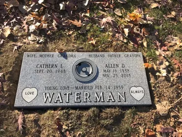
Slightly raised markers with a gentle slope for readability while staying low to the ground.</p>
              <div class="product-card__meta">
                <span>More readable than flat</span>
                <span>Classic look</span>
              </div>
              <div class="product-card__actions">
                <a class="btn btn-small btn-primary" href="/order.html?product=Bevel%20Markers">Order Now</a>
                <a class="btn btn-small btn-outline" href="/gallery.html">See Examples</a>
              </div>
            </div>
          </article>

          <!-- SLANT -->
          <article class="product-card" data-category="slant">
            <div class="product-card__img">
              <img src="/assets/img/Upright/gallery-7.jpg" alt="Slant marker" loading="lazy" />
              <div class="img-label">SLANT</div>
              <a class="img-order" href="/order.html?product=Slant%20Markers" aria-label="Order Slant Markers">Order Now</a>
            </div>
            <div class="product-card__body">
              <h3>Slant Markers</h3>
              <p>
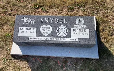
Angled-face markers that provide stronger visibility while keeping a compact footprint.</p>
              <div class="product-card__meta">
                <span>Great readability</span>
                <span>Elegant profile</span>
              </div>
              <div class="product-card__actions">
                <a class="btn btn-small btn-primary" href="/order.html?product=Slant%20Markers">Order Now</a>
                <a class="btn btn-small btn-outline" href="/gallery.html">See Examples</a>
              </div>
            </div>
          </article>

          <!-- BRONZE -->
          <article class="product-card" data-category="bronze flat bevel">
            <div class="product-card__img">
              <img src="/assets/img/Flats/gallery-20.jpg" alt="Bronze marker" loading="lazy" />
              <div class="img-label">BRONZE</div>
              <a class="img-order" href="/order.html?product=Bronze%20Markers" aria-label="Order Bronze Markers">Order Now</a>
            </div>
            <div class="product-card__body">
              <h3>Bronze Markers</h3>
              <p>
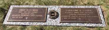
Durable bronze options with classic appearance. Often paired with granite bases if required.</p>
              <div class="product-card__meta">
                <span>Premium finish</span>
                <span>Long-lasting</span>
              </div>
              <div class="product-card__actions">
                <a class="btn btn-small btn-primary" href="/order.html?product=Bronze%20Markers">Order Now</a>
                <a class="btn btn-small btn-outline" href="/gallery.html">See Examples</a>
              </div>
            </div>
          </article>

          <!-- CUSTOM -->
          <article class="product-card" data-category="custom upright flat bevel slant">
            <div class="product-card__img">
              <img src="/assets/img/Upright/gallery-12.jpg" alt="Custom designed monument" loading="lazy" />
              <div class="img-label">CUSTOM</div>
              <a class="img-order" href="/order.html?product=Custom%20Monuments" aria-label="Order Custom Monuments">Order Now</a>
            </div>
            <div class="product-card__body">
              <h3>Custom Monuments</h3>
              <p>
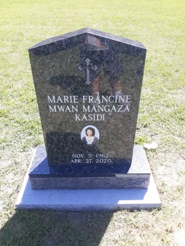
Unique shapes, etching, portraits, special artwork, and custom inscriptions tailored to your vision.</p>
              <div class="product-card__meta">
                <span>Proof provided</span>
                <span>Personalized details</span>
              </div>
              <div class="product-card__actions">
                <a class="btn btn-small btn-primary" href="/order.html?product=Custom%20Monuments">Order Now</a>
                <a class="btn btn-small btn-outline" href="/contact.html">Request Pricing</a>
              </div>
            </div>
          </article>

          <!-- BENCH -->
          <article class="product-card" data-category="bench custom">
            <div class="product-card__img">
              <img src="/assets/img/Benches/gallery-3.jpg" alt="Memorial bench" loading="lazy" />
              <div class="img-label">BENCH</div>
              <a class="img-order" href="/order.html?product=Memorial%20Benches" aria-label="Order Memorial Benches">Order Now</a>
            </div>
            <div class="product-card__body">
              <h3>Memorial Benches</h3>
              <p>
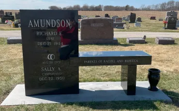
Beautiful, functional tributes—ideal for cemetery benches, gardens, and remembrance spaces.</p>
              <div class="product-card__meta">
                <span>Custom inscription</span>
                <span>Multiple styles</span>
              </div>
              <div class="product-card__actions">
                <a class="btn btn-small btn-primary" href="/order.html?product=Memorial%20Benches">Order Now</a>
                <a class="btn btn-small btn-outline" href="/gallery.html">See Examples</a>
              </div>
            </div>
          </article>

          <!-- SIGNS -->
          <article class="product-card" data-category="sign custom">
            <div class="product-card__img">
              <img src="/assets/img/Upright/gallery-14.jpg" alt="Cemetery or memorial signage" loading="lazy" />
              <div class="img-label">SIGNS</div>
              <a class="img-order" href="/order.html?product=Signs%20and%20Specialty%20Pieces" aria-label="Order Signs and Specialty Pieces">Order Now</a>
            </div>
            <div class="product-card__body">
              <h3>Signs & Specialty Pieces</h3>
              <p>Cemetery signs, section markers, dedication plaques, and specialty memorial pieces.</p>
              <div class="product-card__meta">
                <span>Built to spec</span>
                <span>Professional layout</span>
              </div>
              <div class="product-card__actions">
                <a class="btn btn-small btn-primary" href="/order.html?product=Signs%20and%20Specialty%20Pieces">Order Now</a>
                <a class="btn btn-small btn-outline" href="/contact.html">Request Pricing</a>
              </div>
            </div>
          </article>

          <!-- ETHNIC / ASIAN -->
          <article class="product-card" data-category="ethnic custom upright">
            <div class="product-card__img">
              <img src="/assets/img/Upright/gallery-18.jpg" alt="Ethnic and Asian style monument options" loading="lazy" />
              <div class="img-label">ETHNIC</div>
              <a class="img-order" href="/order.html?product=Ethnic%20and%20Asian%20Options" aria-label="Order Ethnic and Asian Options">Order Now</a>
            </div>
            <div class="product-card__body">
              <h3>Ethnic & Asian Options</h3>
              <p>Designs that honor cultural traditions, including custom shapes, languages, symbols, and layout styles.</p>
              <div class="product-card__meta">
                <span>Custom languages</span>
                <span>Respectful design</span>
              </div>
              <div class="product-card__actions">
                <a class="btn btn-small btn-primary" href="/order.html?product=Ethnic%20and%20Asian%20Options">Order Now</a>
                <a class="btn btn-small btn-outline" href="/contact.html">Request Pricing</a>
              </div>
            </div>
          </article>

          <!-- URNS (optional extra card since you have an Urns folder) -->
          <article class="product-card" data-category="custom urn">
            <div class="product-card__img">
              <img src="/assets/img/Urns/gallery-6.jpg" alt="Cremation urn memorial" loading="lazy" />
              <div class="img-label">URNS</div>
              <a class="img-order" href="/order.html?product=Cremation%20Urns%20and%20Memorials" aria-label="Order Cremation Urns and Memorials">Order Now</a>
            </div>
            <div class="product-card__body">
              <h3>Cremation Urns & Memorials</h3>
              <p>
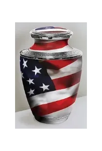
Elegant urns and cremation memorial options with personalization available.</p>
              <div class="product-card__meta">
                <span>Personalized options</span>
                <span>Multiple styles</span>
              </div>
              <div class="product-card__actions">
                <a class="btn btn-small btn-primary" href="/order.html?product=Cremation%20Urns%20and%20Memorials">Order Now</a>
                <a class="btn btn-small btn-outline" href="/gallery.html">See Examples</a>
              </div>
            </div>
          </article>

        </div>
      </div>
    </section>

    <!-- BOTTOM CTA -->
    <section class="section section--cta">
      <div class="container">
        <div class="cta-band">
          <div class="cta-band__copy">
            <h2>Ready to get pricing and options?</h2>
            <p>
              Click “Order Now” on any product to send your request to our office.
              We’ll confirm details, provide pricing, and guide design/engraving decisions.
            </p>
          </div>
          <div class="cta-band__actions">
            <a class="btn btn-primary" href="/book.html">Book a Consultation</a>
            <a class="btn btn-outline" href="/gallery.html">View Gallery</a>
            <a class="btn btn-outline" href="tel:+18168674650">Call Now</a>
          </div>
        </div>
      </div>
    </section>

  </main>

  <div id="site-footer"></div>
</body>
</html>